Overview
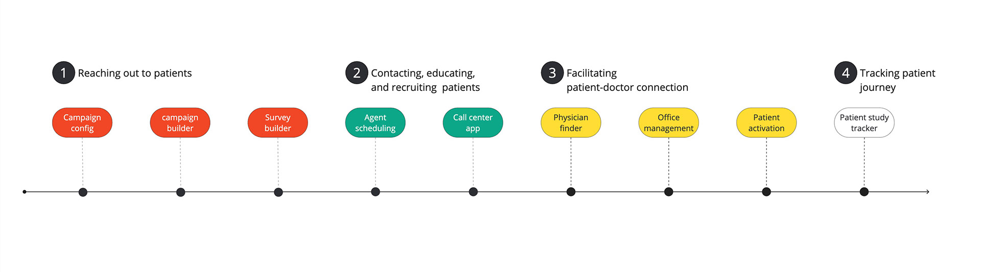
Imagine a bustling hub where connections between patients and healthcare clients for clinical trial studies and new commercial devices come to life. At 83 Bar, our dedication lies in streamlining the process for all stakeholders involved in clinical trials and healthcare studies. With every connection made, we move one step closer to advancing healthcare and improving lives.
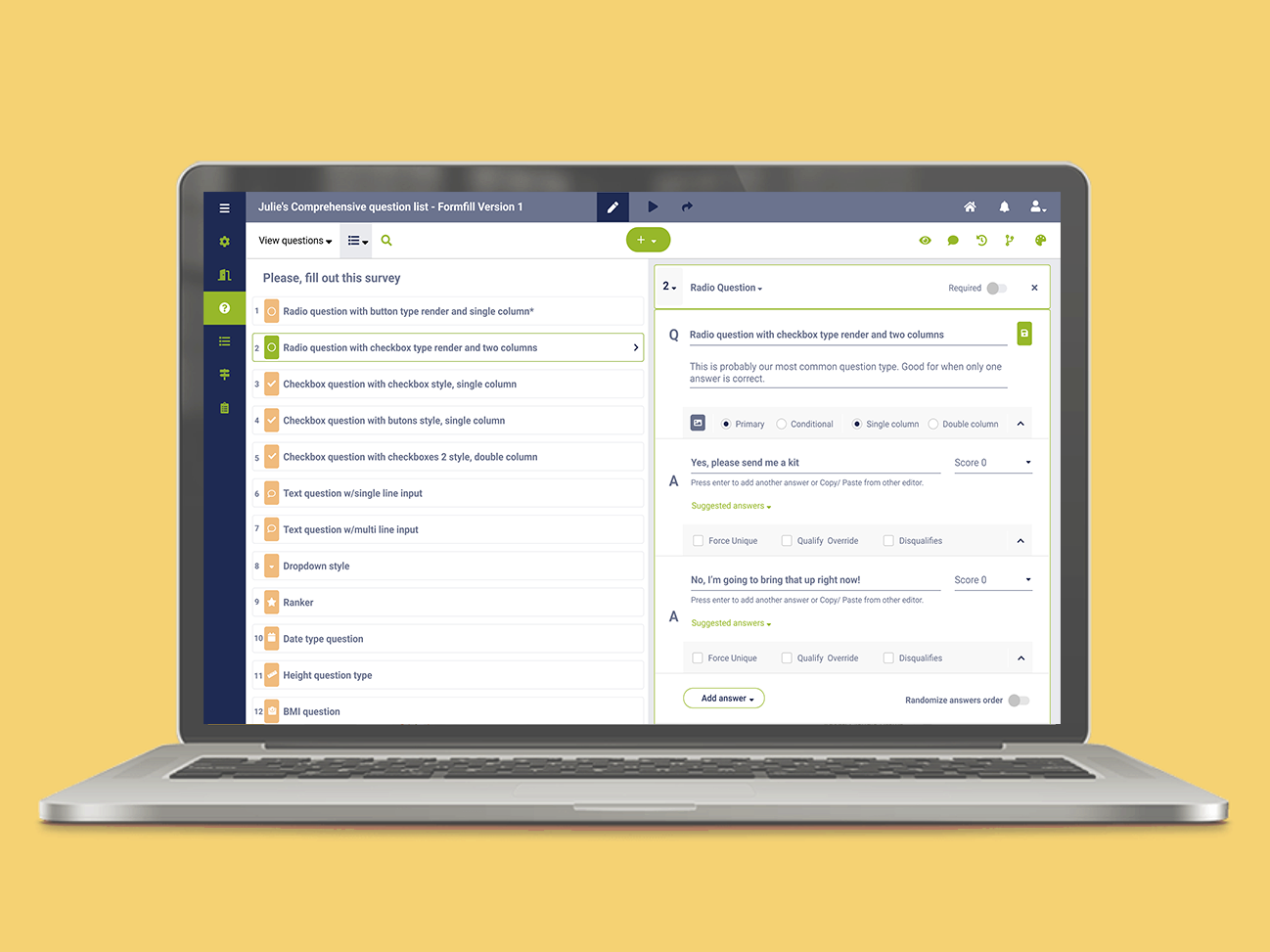
In our world, digital marketing reigns supreme. Our digital marketing team utilizes a suite of powerful tools—Campaign Configuration, Campaign Builder, and Survey Builder—to craft compelling campaigns aimed at reaching out to patients for clinical trial participation. With precision and strategy, we lay the groundwork for impactful patient recruitment.
But our journey doesn't end there. Enter our dedicated team of nurses and Call Center agents, armed with our Call Center web application. Their mission? To contact, educate, and recruit patients with care and efficiency. Behind the scenes, the Agent Scheduling App ensures seamless coordination, allowing Call Center Managers to organize agents' schedules with precision.
In the quest for patient-doctor connections, we offer the Physician Finder App—an essential tool utilized by both agents and patients to locate offices and providers. Meanwhile, the Office Management App supports medical offices in patient recruitment, while the Activation Hub empowers users within physician's offices to manage patient journeys and information with ease.
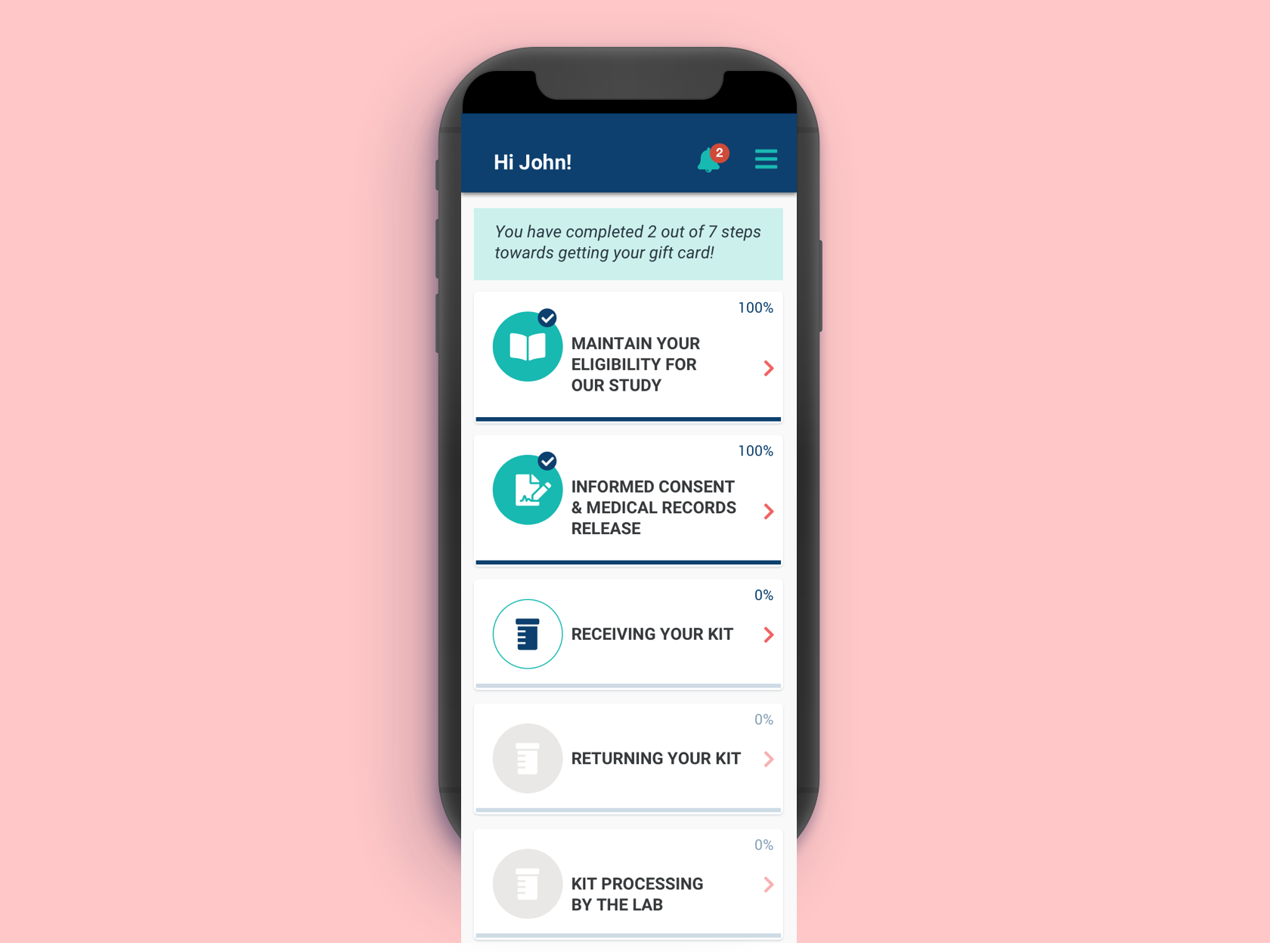
And what about the patients themselves? They remain at the heart of our endeavor. With our Study Tracker application, patients can monitor and engage in real-time communication during studies, ensuring a comprehensive cycle of care and support.
The Challenge and the Why
A bustling call center, abuzz with activity as agents strive to connect with and recruit potential clients for vital healthcare studies. But behind the scenes, a challenge looms large—an outdated and cumbersome call center application is hindering their efforts.
New agents, eager to make a difference, find themselves lost in a maze of confusing navigation, while technical glitches disrupt their interactions with patients, leaving frustration in their wake. The result? A high turnover rate and a chorus of complaints echoing through the call center.
Recognizing the urgency of the situation, we brought our findings to the management team. It was clear: a redesign of the Call Center application was essential to unlock the full potential of our agents and improve patient recruitment processes.
And so, armed with a clear mission and a determination to make a difference, we embarked on our journey. Our high-level approach was simple yet ambitious: to enhance the user experience for 83 Bar call center agents and nurses, empower nurses with greater control over call and app information, and create a platform that seamlessly gathers all lead information in one place.
My role and timeframe
As the sole Product Designer, I played a pivotal role in a cross-functional remote team dedicated to redesigning the Call Center application. Collaborating with the Product Owner, Project Manager, Front End and Back End Developers, Quality Assurance Specialists, and others, I contributed from the research phase to testing with real users.
The project spanned three months, from February to May, culminating in the launch of the redesigned application in June. Throughout this timeframe, my focus was on crafting user-centric solutions that addressed the challenges faced by call center agents and nurses, ensuring a seamless and efficient recruitment process.
To comply with my nondisclosure agreement, all information in this case study is my own and does not necessarily reflect the views of 83 Bar.
Starting with research
Early Insights from the Field and Our App in Use.
In our quest to improve the Call Center application, we embarked on several evaluative research sessions. One of our key methodologies was the Cognitive Walkthrough, aimed at gaining deep insights into the existing app's usability and functionality.
We conducted extensive testing with five users in real-world scenarios, where they interacted with the app while contacting a lead. During these sessions, we guided agents through the app, encouraging them to think aloud and provide candid feedback. Open-ended questions prompted discussions about their experiences, needs, and frustrations.
Through this hands-on approach, we gained valuable insights into the users' perspectives, uncovering their pain points and desires. These early insights from the field provided a solid foundation for refining the Call Center application, ensuring that our redesign would address the specific needs and challenges faced by our users.
The Problem
"Nurses are constantly annoyed when using the app because they can't easily find the necessary information."
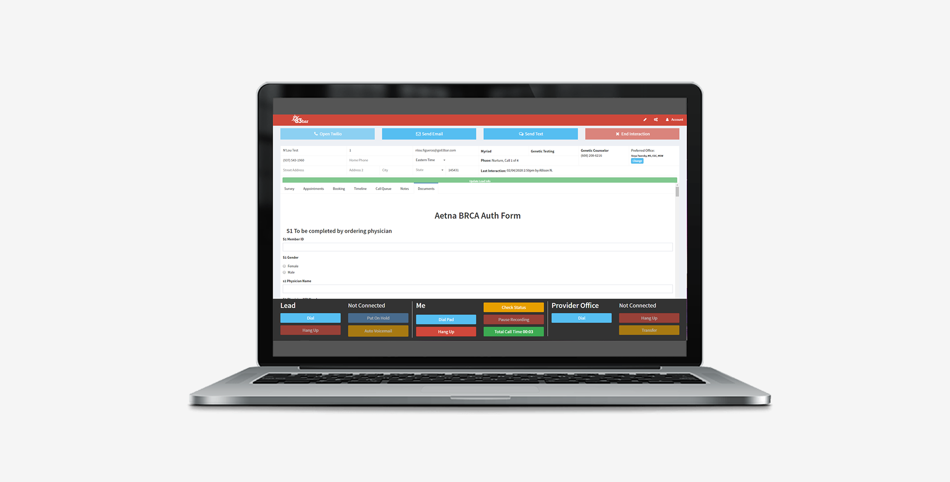
The challenge facing our nurses and Call Center agents is multi-faceted. As they work tirelessly to recruit patients using our Call Center web app, they are burdened by the cumbersome task of juggling multiple applications simultaneously. In addition to our web app, agents are required to navigate three other applications while conducting phone calls with patients, leading to a division of screen space and cognitive overload.
Amidst this chaos, the agents are expected to swiftly gather and process personal patient information, make contact with leads via phone calls, and facilitate patient transfers to physician offices. However, their efforts are hampered by the fragmented nature of information across various applications, causing frustration and inefficiency. They are constantly challenged to access comprehensive patient information quickly and easily during calls, impeding their ability to effectively recruit patients in a timely manner.
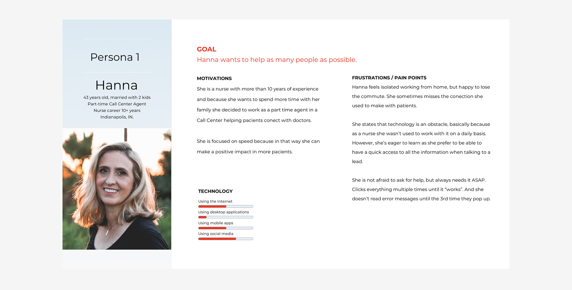
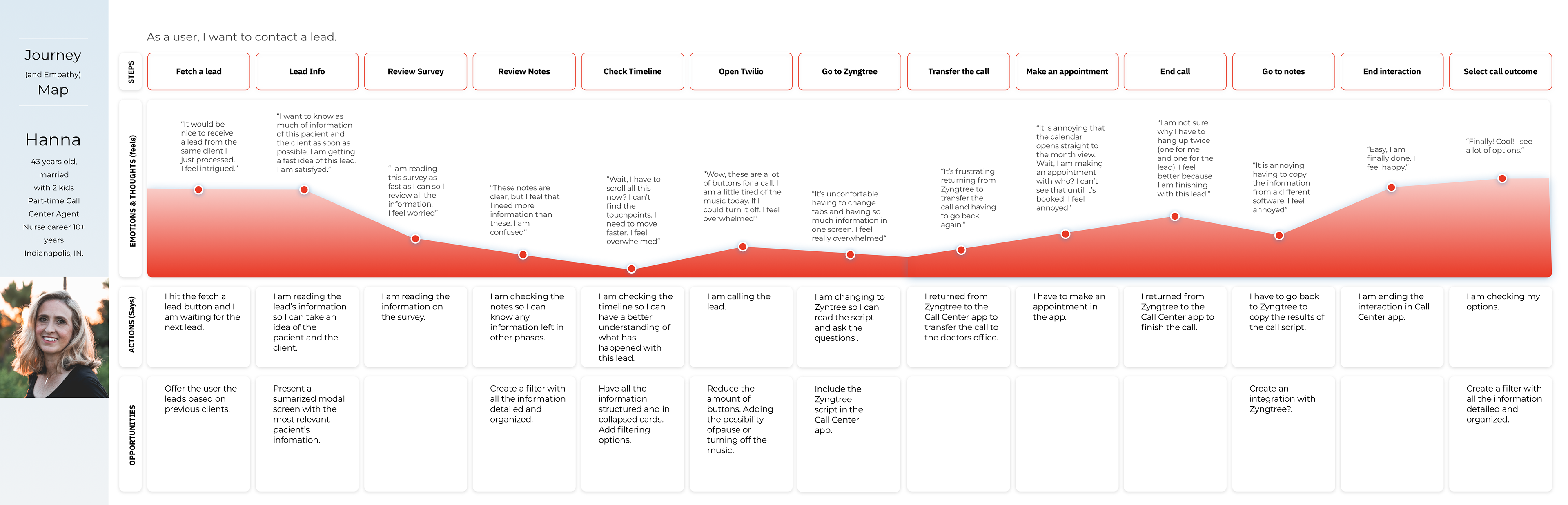
Our Persona & User Journey
Through our interviews, we gained valuable insights into the needs and preferences of our users:
Limited Screen Space: Agents often face challenges with limited screen space, with some resorting to dividing the screen to accommodate other tools.
Non-technical Expertise: Our users exhibit varying levels of technical proficiency, with many not being technology experts.
Non-tech Savvy Users: Users struggle with multitasking across multiple apps during calls, highlighting their limited technical expertise.
Preference for Visual Simplicity: Users prefer visually simplified interfaces that enable efficient task performance.
Desire for Comprehensive Information: Users expressed a strong desire to access as much information as possible about potential customers.
Our users' experiences are fraught with challenges:
Overwhelming Timeline: The timeline feature, critical for understanding lead history, overwhelms users with its length and amount of information, hindering quick comprehension.
Information Transfer Struggles: Users encounter difficulties when copying information between apps while on a call with leads, disrupting workflow and efficiency.
Desire for Immediate Access to Information: Users value having all pertinent information readily available upon opening the app, even if some redundancy is involved, to facilitate quick decision-making and communication.
Disorientation with Incoming Calls: Answering incoming calls becomes disorienting as users must navigate between two different apps to find lead information, leading to delays and frustration.
Armed with these insights, we structured our personas and users' journeys to ensure that our design solutions catered to the specific needs and preferences of our target users.
Competitive Analysis
In our quest to enhance our Call Center application, we conducted a thorough analysis of competitor applications. This meticulous examination allowed us to identify the strengths and weaknesses of existing solutions, providing valuable insights and inspiration for our redesign efforts.
By studying the competition, we gained a deeper understanding of industry trends, innovative features, and potential pitfalls. We scrutinized user interfaces, functionality, and overall user experience to pinpoint areas for improvement and innovation.
Through this analysis, we unearthed a wealth of new ideas and solutions to address the challenges faced by our users. Armed with these insights, we set out to design a Call Center application that would not only meet but exceed the expectations of our users and set a new standard for excellence in the industry.

Ideation
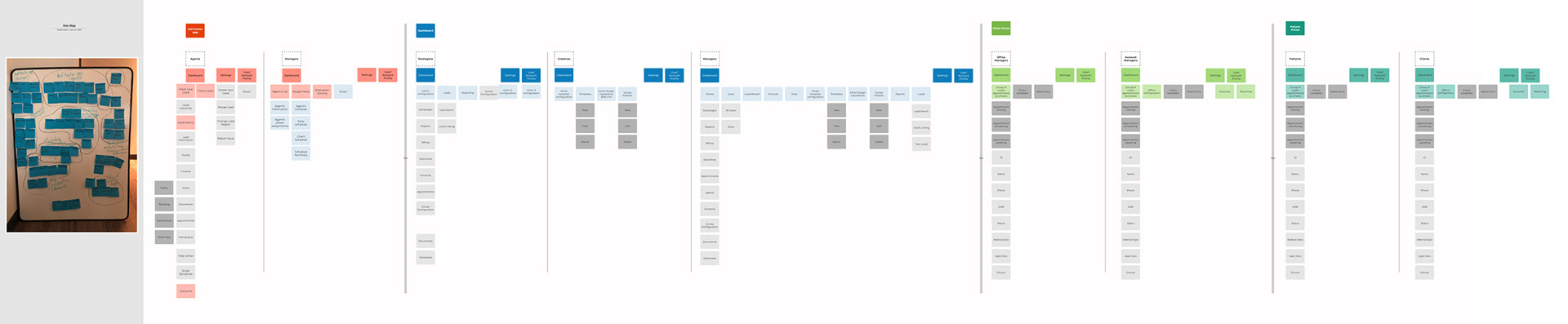
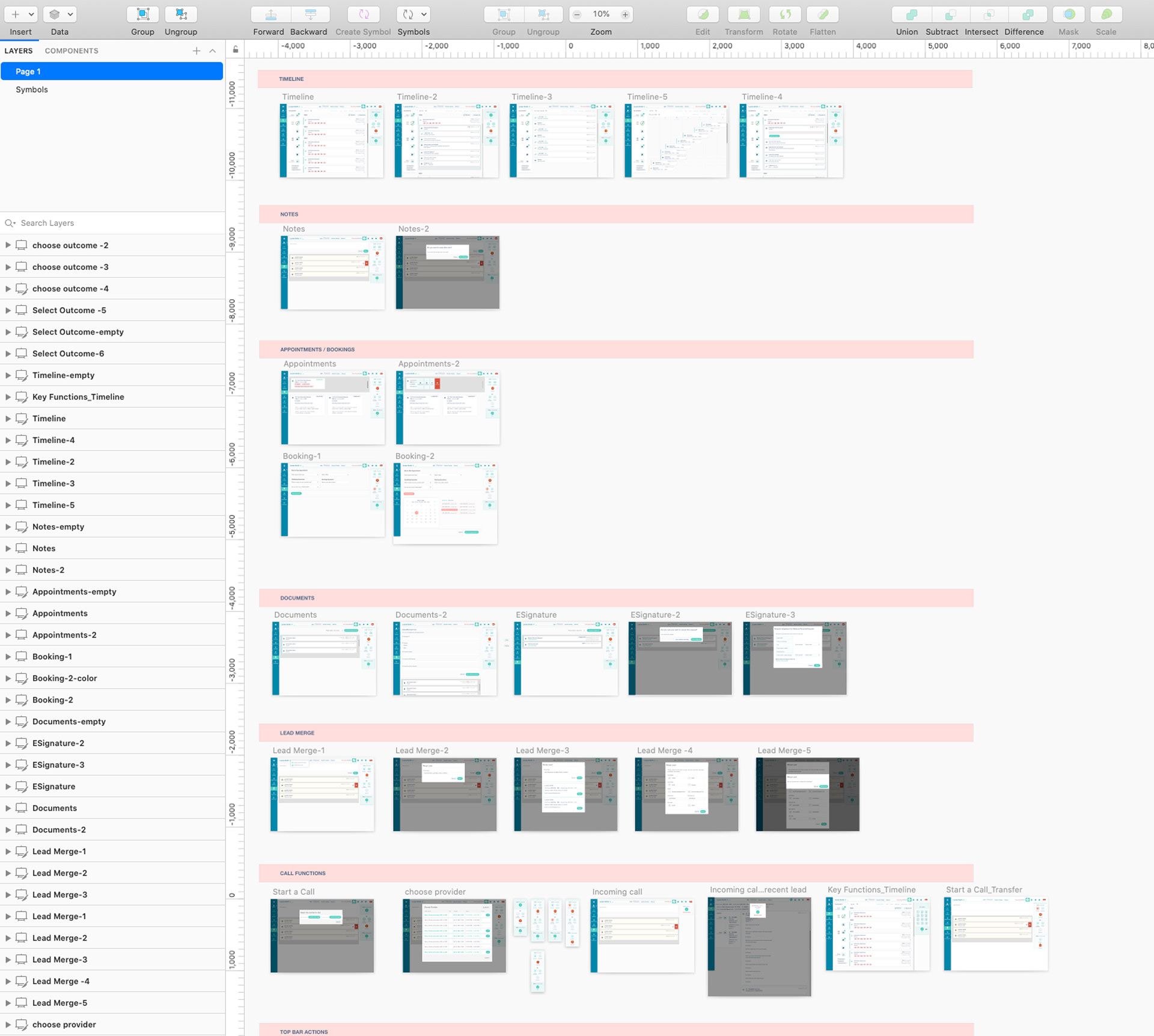
Information Architecture / Site Maps / Lo-Fi Wireframes.
“...how might we help our Agents to have a better experience when contacting a lead?”
During the ideation phase of our project, we conducted several evaluative research sessions to inform our design decisions. One key aspect of this process was analyzing the Information Architecture (IA) of current applications.
To begin, we created a comprehensive content inventory, cataloging all the information present in the applications. We then employed techniques such as card-sorting and content clustering to organize this information effectively. Our goal was to group or regroup the information as needed to create a more cohesive and intuitive user experience.
With the information collected and organized into clusters, we crafted a detailed site map that encompassed all of the company's applications and their respective information. This site map served as a blueprint for unifying the products while streamlining their design and development processes.
By systematically analyzing and restructuring the IA, we aimed to create a more user-friendly experience across all of the company's applications. This approach ensured that users could easily navigate between different tools and access the information they needed efficiently, ultimately enhancing the overall usability and effectiveness of our products.
The solution
To address the challenges faced by our users, we have implemented several solutions:
Streamlined Timeline Interface: We redesigned the timeline feature to present information in a more organized and digestible manner. By prioritizing key events and streamlining the display, we aimed to reduce clutter and enhance comprehension. Users can now quickly grasp lead history without feeling overwhelmed by excessive information.
Integrated Data Transfer Functionality: We introduced seamless data transfer functionality within the app, allowing users to effortlessly copy information between different applications while on a call with leads. This eliminates the need for manual input, streamlining workflow and improving efficiency.
Unified Call Handling Interface: We integrated lead information directly into the call handling interface, eliminating the need for users to navigate between multiple apps when answering incoming calls. This unified approach minimizes disorientation and frustration, enabling users to efficiently manage calls and access lead information without interruption.
Enhanced Information Accessibility: We revamped the app's interface to ensure immediate access to pertinent information upon opening the app. By presenting relevant data upfront, even if it involves some redundancy, users can quickly make informed decisions and communicate effectively without unnecessary delays.
To address the challenge of creating a unified layout for all company applications while providing relevant information to each user group, we devised a solution centered around lo-fi wireframes utilizing the concept of cards.By leveraging the versatility of cards, we aimed to tailor the layout to meet the specific needs of different user groups. For instance, agents focused solely on call center tasks would be presented with cards relevant to their workflow, while managers would have access to additional cards for overseeing their team's activities.
This approach not only streamlined the user experience but also addressed the issue of space management. Cards allowed us to organize information in a modular format, making it easier to rearrange and optimize for responsiveness across various devices and screen sizes.
Ultimately, our use of lo-fi wireframes and card-based design ensured that each user group received the necessary information in a visually simplified and user-friendly manner, enhancing overall usability and efficiency across all company applications.

Enhanced Information Accessibility by using cards

The Ideation process was designed using Miro and Lucidchart. The Hi-Fi design wireframes were designed using Sketch app and the Prototype using Invision.
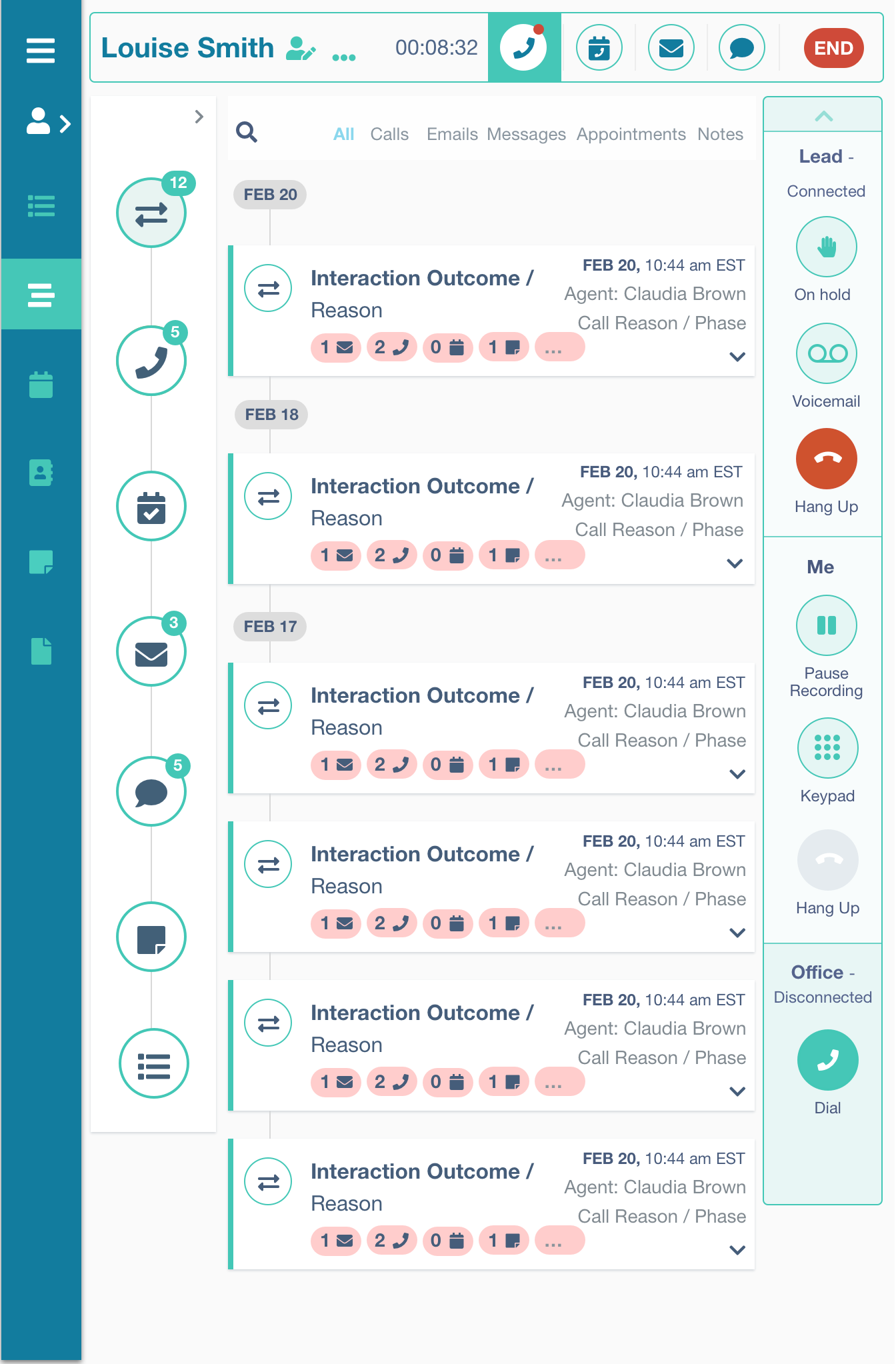
Timeline / Responsive /
Streamlined Timeline Interface by prioritizing key events and streamlining the display, we aimed to reduce clutter and enhance comprehension.
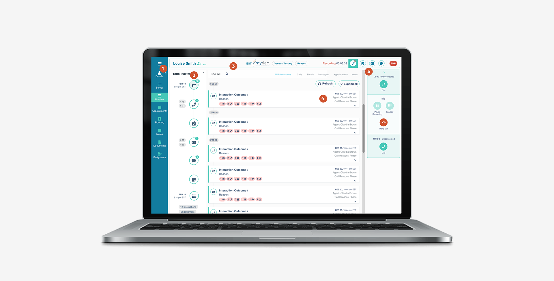
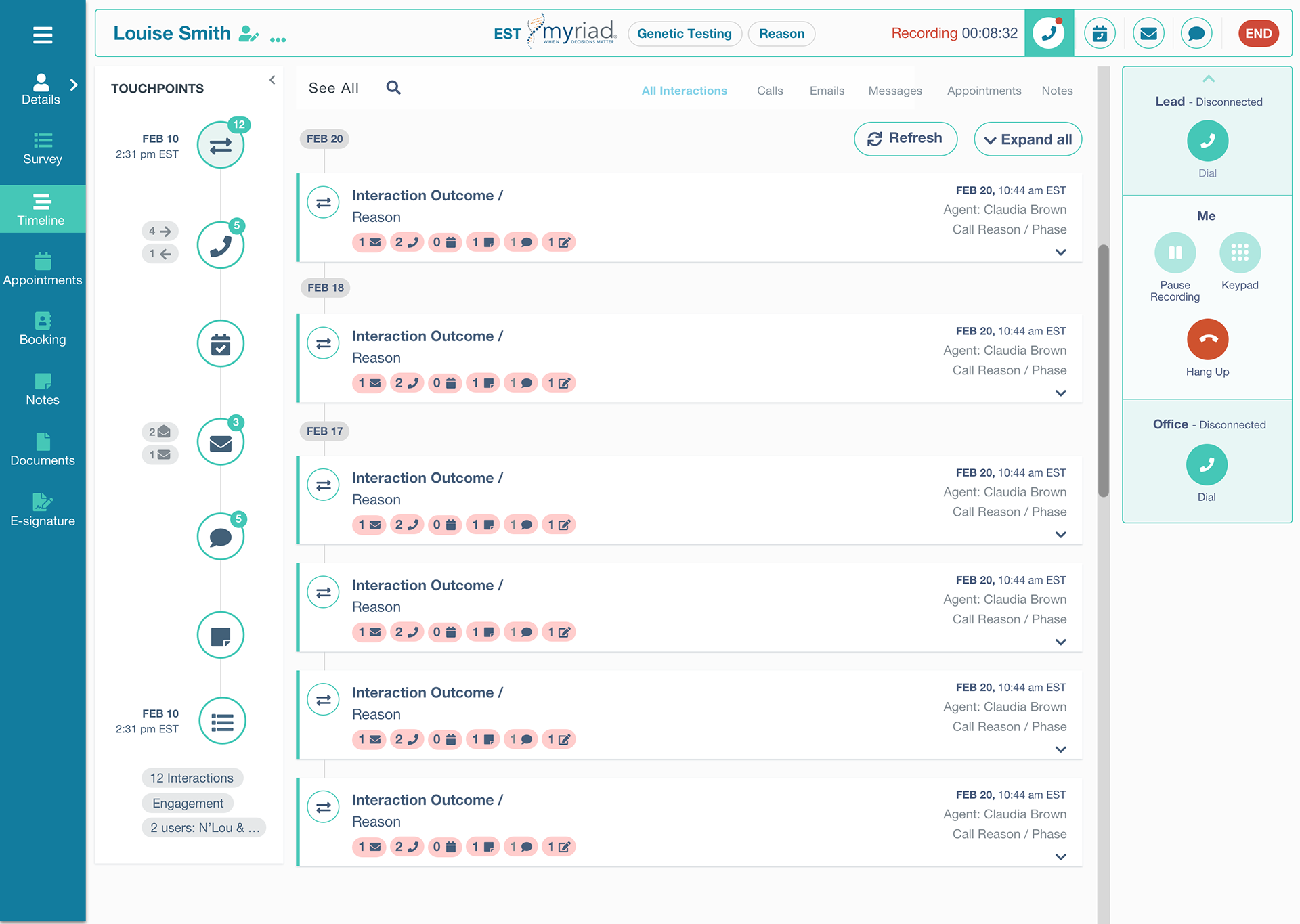

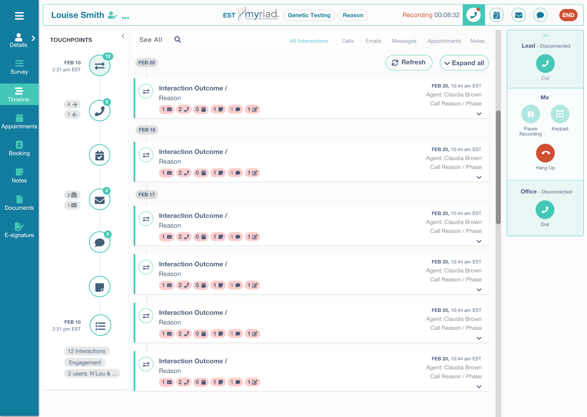
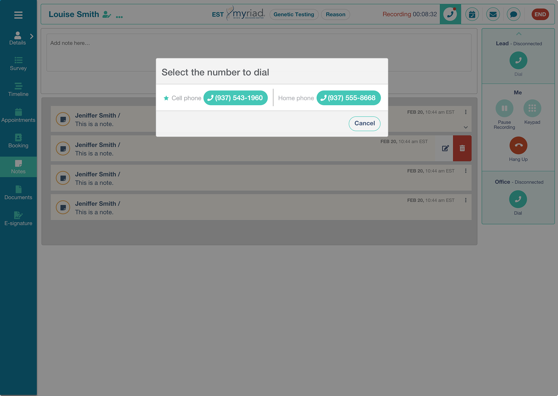
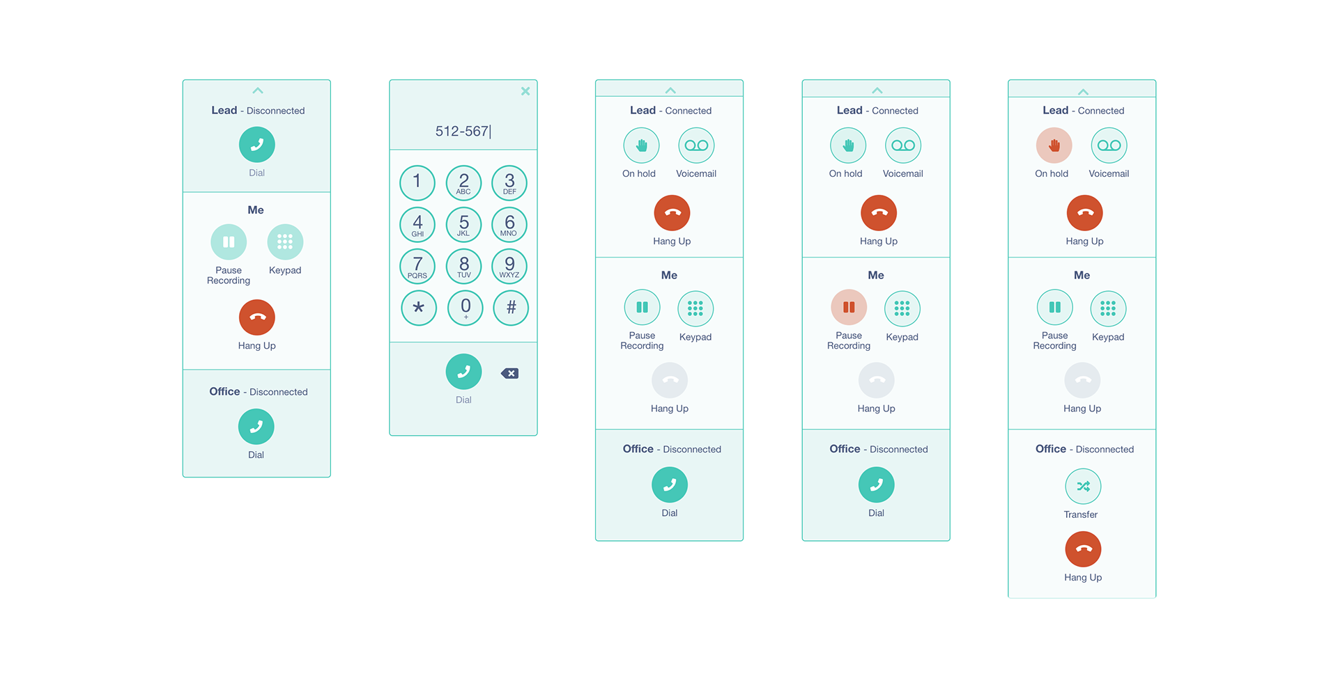
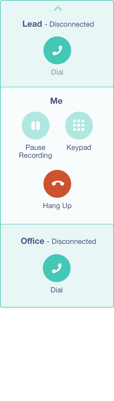
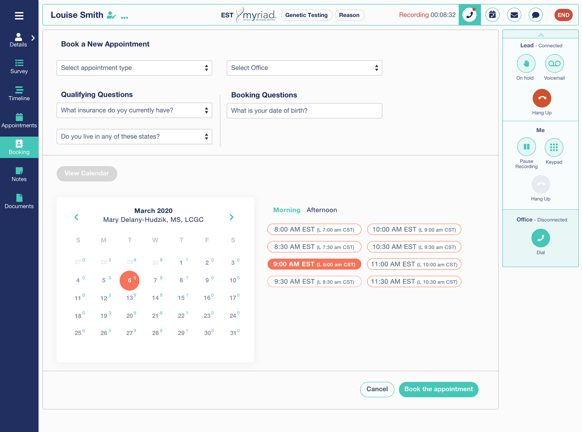
Call functions
Integrated Data Transfer Functionality: We introduced seamless data transfer functionality within the app, allowing users to effortlessly copy information between different applications while on a call with leads.
Unified Call Handling Interface: We integrated lead information directly into the call handling interface, eliminating the need for users to navigate between multiple apps when answering incoming calls.

Validating the solution: Usability Testing
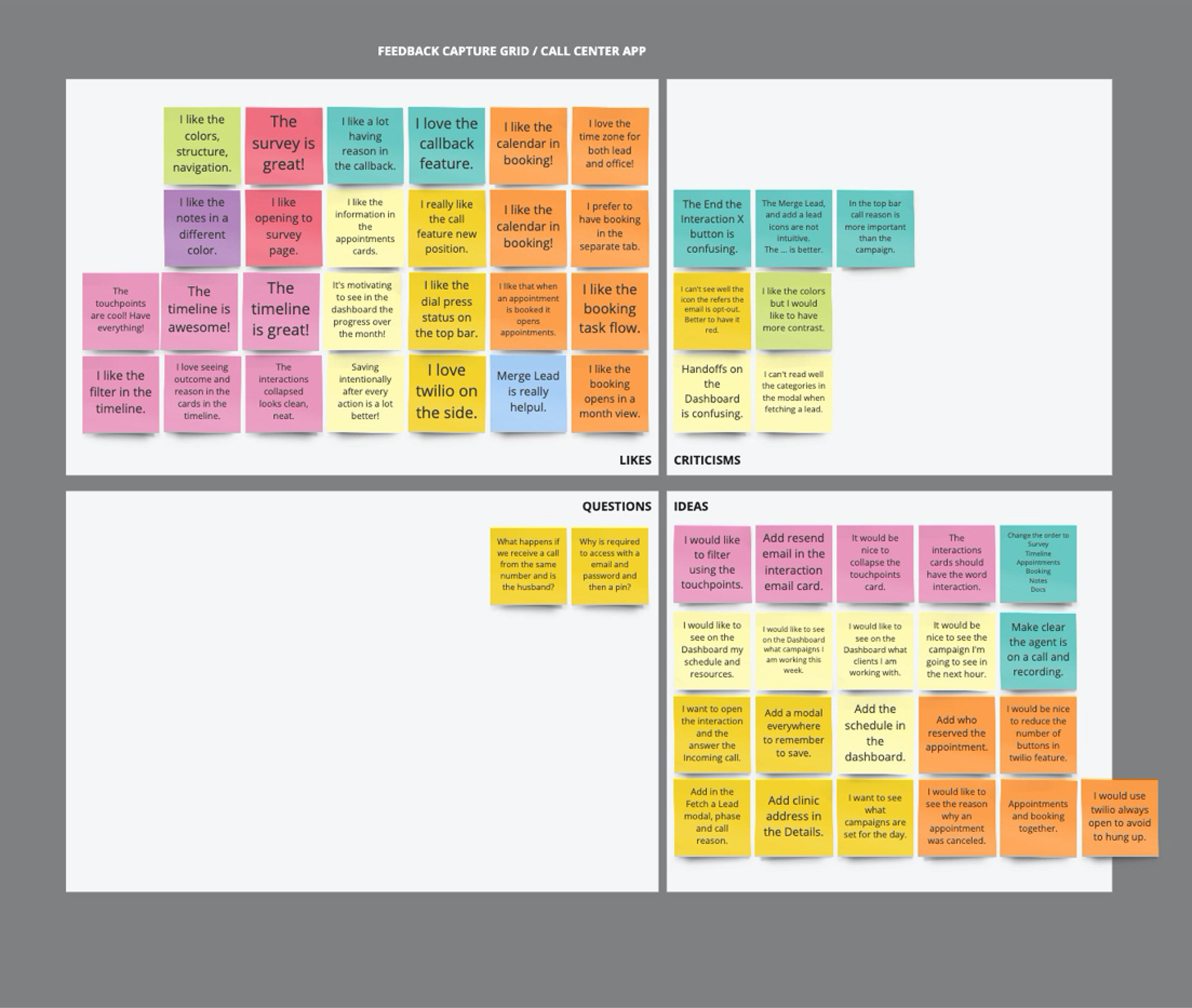
To validate the effectiveness of our solutions, we conducted several sessions of evaluative research, focusing on usability, process efficiency, and accessibility in the redesigned app.
We employed a Cognitive Walkthrough as a research technique to assess usability. Five users were interviewed and guided through the app, instructed to think aloud and provide feedback on various features. This approach allowed us to gain insights into how users interacted with the app and identify any usability issues or areas for improvement.
During the walkthroughs, users were asked open-ended questions to elicit detailed feedback on their experience. Their responses were recorded and organized using a Feedback Grid, enabling us to systematically analyze and categorize the data.
By gathering feedback directly from end-users, we were able to validate the effectiveness of our solutions and identify any remaining pain points or areas requiring further refinement. This user-centric approach ensured that our redesigned app met the needs and expectations of our target audience, ultimately enhancing its usability, efficiency, and accessibility.

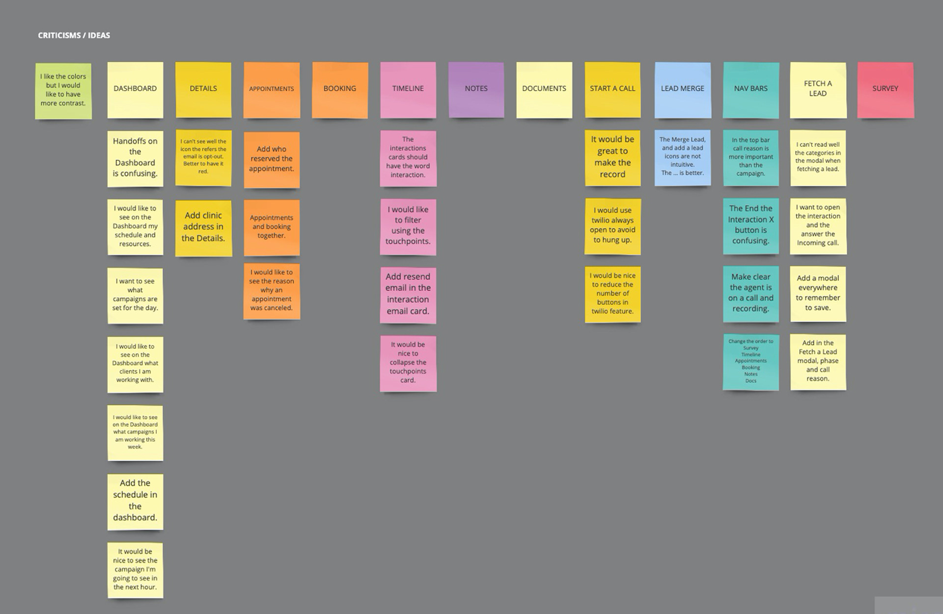
To address the findings from testing, we made the following adjustments:
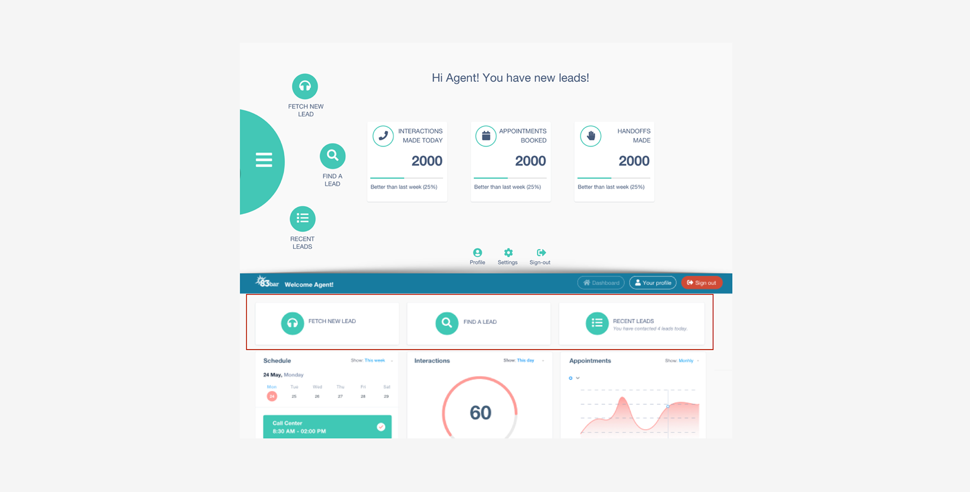
Restructured Dashboard: Implemented a responsive dashboard layout using cards to optimize space utilization.
Added New Information: Incorporated additional information such as schedules into the dashboard for enhanced usability.
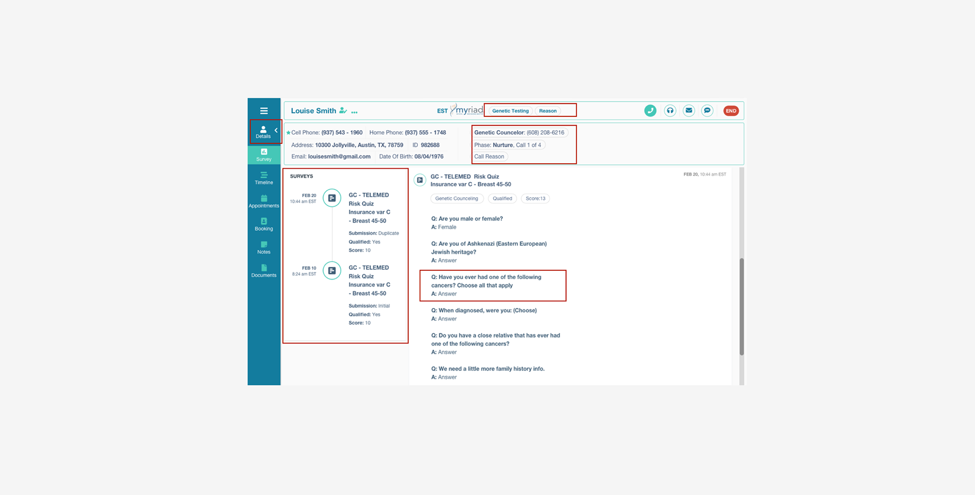
Restructured Details: Refined the layout of detailed information sections to improve readability and accessibility.
Enhanced Survey Display: Maintained a clear visual structure for survey questions and answers to aid comprehension.
Simplified Survey Card: Removed the "Surveys" card if only one survey is available to reduce clutter.
Introduced Color Themes: Integrated brand colors as the main theme to create a cohesive visual identity.
Redesigned Call Feature: Restructured the call feature for improved functionality and ease of use.
These adjustments were made based on user feedback to ensure that the app meets the needs and preferences of our target users, ultimately enhancing their experience and usability.
Outcome. What's next?

The outcome of our efforts resulted in the successful implementation of a minimum viable product (MVP), continuously refined based on feedback from agents regarding daily app usage. We've prioritized user feedback to drive iterative improvements, ensuring that the app remains user-centric and addresses evolving needs.
Looking ahead, our primary focus for the next iteration is to place a greater emphasis on accessibility. We recognize the importance of catering to extreme users who may require specific accommodations, ensuring that the app remains inclusive and accessible to all.
Furthermore, to address the initial problem of screen clutter and multitasking, our next project will involve integrating information from other applications used by agents during calls. By consolidating relevant data into a single application interface, we aim to streamline workflow and enhance user efficiency. This initiative aligns with our goal of providing agents with a seamless and focused user experience, ultimately improving productivity and user satisfaction.
Case Study In Process...